
Brand identity · Symbolic design
Organization: Unity Health Toronto
My role: Lead designer (concept, logo design, visual refinement)
Deliverables: Logo, engagement visuals
Audience: Staff, physicians, learners, partners
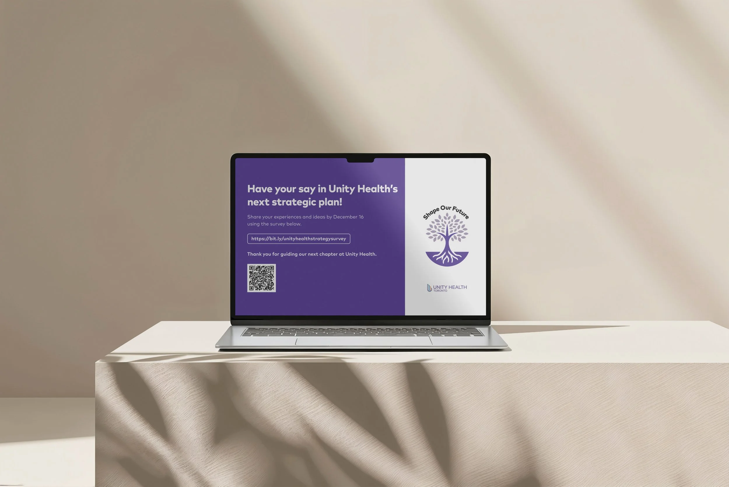
Created the tree logo for Unity Health Toronto’s 2026 strategic planning initiative, Shape Our Future. The logo served as a unifying visual symbol throughout the engagement process, representing growth, connection, and collective impact. The goal was to develop an identity that felt meaningful, inclusive, and aligned with Unity Health’s mission and values.
The strategic planning process required a visual identity that could resonate across diverse audiences and sites while supporting a complex, multi-year organizational effort. The logo needed to be adaptable across digital and print formats, instantly recognizable, and capable of carrying both symbolic meaning and institutional credibility.
Led the concept development and design of the tree logo
Translated strategic themes—growth, roots, and shared direction—into a simple, versatile logo
Balanced Unity Health’s brand standards with the need for a distinct strategic identity, refining the logo to feel both institutional and forward-looking.
Explored symbolic concepts connected to Unity Health’s values and the idea of shaping the future together
Refined the tree shape to balance warmth, clarity, and professionalism
Tested the logo across applications to ensure legibility and consistency
Delivered a final logo that became the core visual anchor for the strategic planning initiative
The tree logo was used across engagement materials, presentations, and communications to create cohesion and recognition
This project reinforced the power of symbolism in organizational design. By grounding the logo in shared values and future-focused storytelling, the tree became more than a visual asset—it functioned as a recognizable emblem of collective growth and direction.